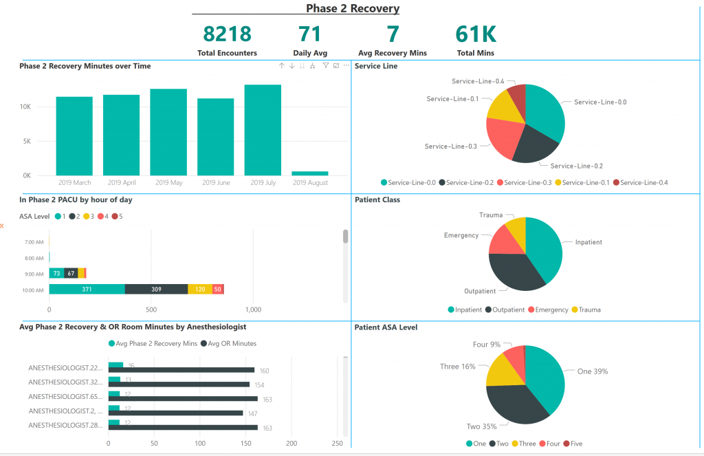
We are doing an early release this week to bring you a couple exciting new feature: the Monthly Facility Summary and the PACU Phase 2 report. The Monthly Facility Summary gives you a quick snapshot of the core KPIs for a facility month-over-month to help you track your performance against your goals – an important part of the Lean process. The PACU Phase 2 report extends the examination of how patients move throughout the recovery phase of care, helping with better planning.
We’re also changing how we publish these release notes. They are now on our public website. Right here.
Last but not least, ORHub announced a new CEO this week. You may recognize Dr. Bobby Lazzara from a few of our videos, including the latest one about the surgical case receipt!
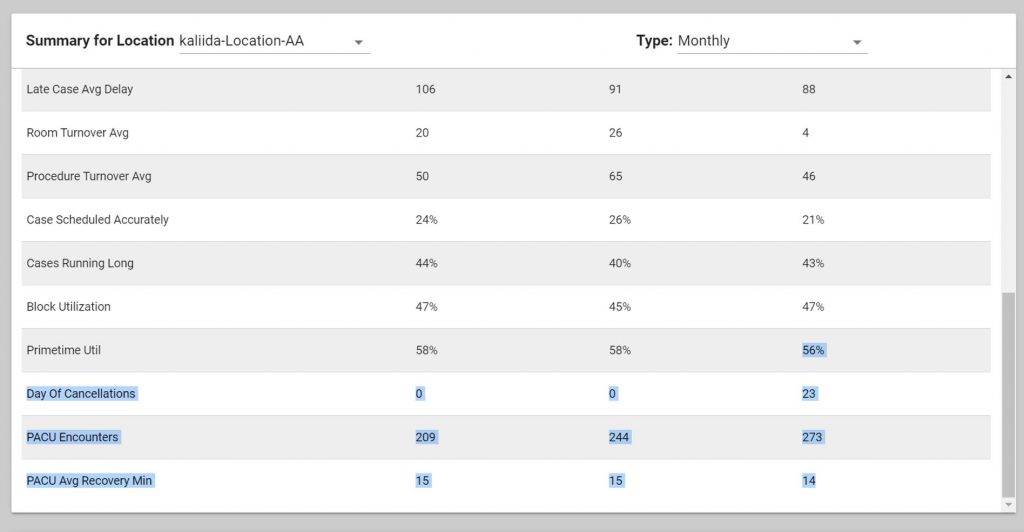
Monthly Facility Summary on the Landing Page
Alvarado Hospital Medical Center has been submitting a monthly overview of metrics to administration and wanted an easier way to gather and report on the key performance indicators of their OR. We added the Monthly Facility Summary to our landing page in response.
Under the “Dashboard” panel (located at the top of the left menu, (1) in the image below), you can select a “Location” and a “Type”. Chose the desired location and then select either ‘daily’ or ‘monthly’ ( (2) in the image below).
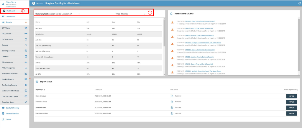
Eventually, this report will have an export function; for now, users can highlight the data with their mouse and copy/paste to a spreadsheet or Power Point file. This is straightforward: scroll to the bottom of the monthly summary, move your mouse to the bottom row and place at the end of the last column; click your mouse and drag to the top of the monthly summary. Then just paste into whatever file format you desire.
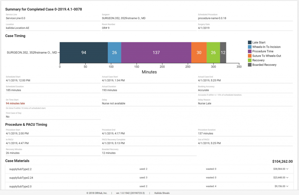
Cadence Visual an Case Viewer
The case viewer is great for validating case data in Surgical Spotlight® and many customers are using it as a way to understand how a single case fits into the big picture.
We will be adding this Cadence view onto the Case Receipt in the future. We believe that Cadence helps customers understand labor costs for surgery, and the case receipt helps get the information to customers in a timely way. Stay tuned for future developments! We’ll be adding intra-operative and post-operative labor costs to both the Case View and Case Receipt!
PACU Phase 2 Report
We’ve added a new report! PACU phase 2 is now avaible to our customers. Not all customers will see it immediately, but we’ll be reaching out to make sure you’re getting the most out of Spotlight. Once it’s activated, you’ll see the report in the menu right beside the PACU Phase 1 report.
[…] one of our recent releases we added a chart of the case timings to our Case Viewer. We improved the chart this week by […]