Category : Product News

First Case On Time Starts – Setting the Pace

Our very own Dr Bobby Lazzara has a new video posted for ORHub. Watch as he explains how First Case On Time Starts (FCOTS) impacts the financial bottom line of the OR.

Dr Bobby Lazzara explains how FCOTS impact morale and the financial bottom line of the OR.

The Cost of First Case On Time Starts

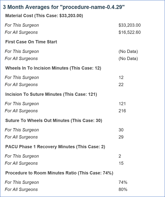
A recent JAMA article shows how an OR minute costs between $36 and $37 in California. An Article in OR Manager describing key benchmarks indicates that the median hospital performs at less than 65% on time for first cases. It also shows that FCOTS is a leading indicator of overall performance.

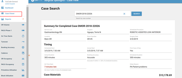
One of the key reasons that First Case On Time Starts are a leading indicator is because of the cascading effect that occurs when a case starts late. It sets the pace for the day both directly and indirectly. Directly, if the first case is late, then unless it runs short (scheduling accuracy is another indicator), the following case will also be delayed. This compounding problem can quickly lead to overtime. But FCOTS also indirectly affect performance by creating a culture of acceptable under performance. A culture of underperformance makes it progressively harder to improve processes.

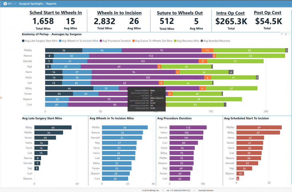
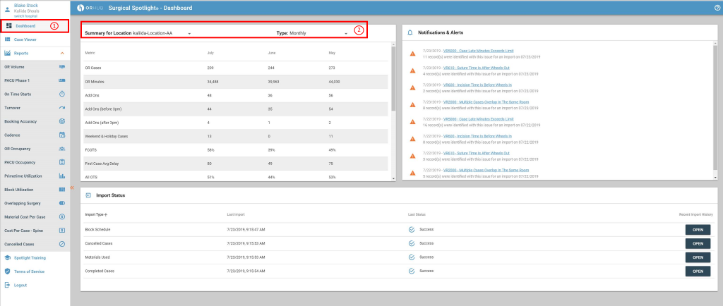
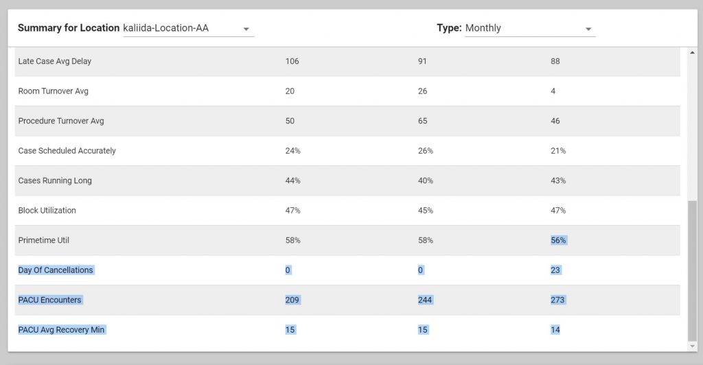
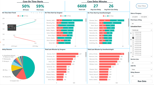
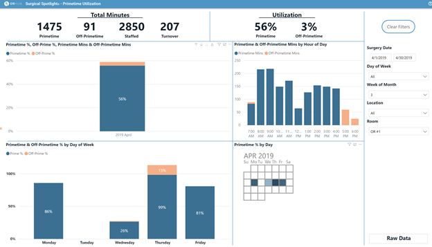
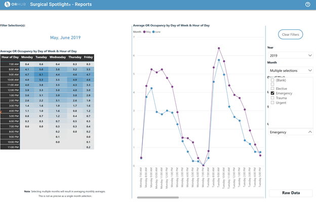
Surgical Spotlight’s On Time Starts Dashboard

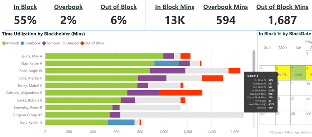
We designed Surgical Spotlight to make investigation of all of the key performance metrics easy. The On Time Starts metrics make it easy to quantify and qualify the impact of FCOTS. Combining this with our Cadence view helps understand overall time usage of the OR.

The On Time Starts dashboard helps you visualize the frequency and impact of FCOTS
The ORHub On Time Starts dashboard makes it easy to visualize how often cases are late and makes it easy to quantify the impact of those late minutes.
The dashboard makes it easy to dive into root causes for late cases.

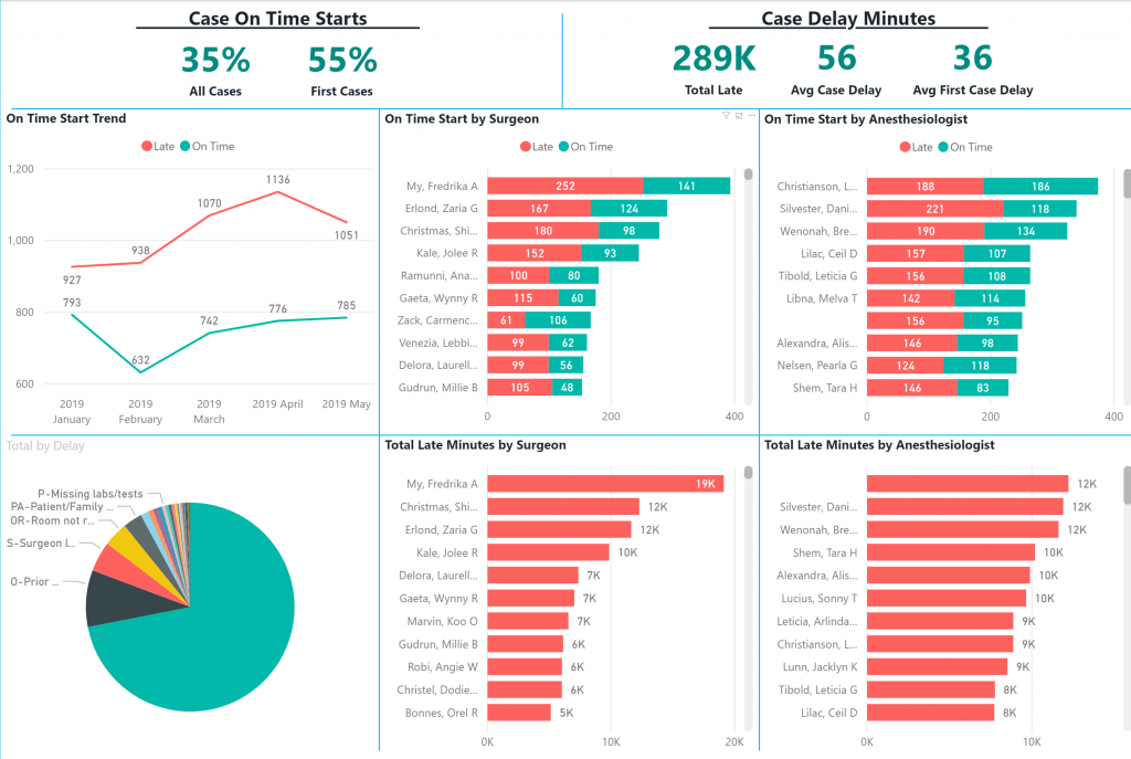
Surgical Spotlight is meant to help improve processes in the OR. It looks at the same metrics outlined in ORManager article (and more) to help measure the OR performance. Once the performance is measured, it helps you identify root causes, and monitor the impact of changes in your OR. FCOTS are important to measure on an ongoing basis; course corrections need to occur before problems become ingrained or insurmountable. Daily and weekly detailed reviews are far more impactful than quarterly, high level summaries.

Release Notes: Surgical time cost breakdown in Cadence

Our latest release adds a surgical time cost breakdown to the cadence KPI’s dashboard. The cost of running an OR can be significant. Recent research showing it averages between $36 and $37 a minute! We’ve also made a few efficiency improvements and dramatically sped up the loading speed of the landing dashboard.

Surgical Time Cost Breakdown in Cadence

One of our customers requested a cost per minute breakdown of their surgery costs. In true ORHub fashion we made the feature available to all of our customers. The cadence view now shows a cost breakdown of surgery. This is based on intra-operative and post-operative costs for all of the cases being viewed. When you hover over each surgeon’s cadence bar we show the breakdown of time cost for that surgeon. This can help lend some financial perspective on how the surgical team is improving.

The cost breakdown can help focus efforts – for instance we can see that there’s a pretty broad variance in late minutes on this view. Our on-time start report can help determine what the primary causes of those late starts are, and help target efforts for improvement. If you who want the details on a case by case basis, the breakdown we announced a few weeks ago showing the cadence graph in the case viewer is very helpful.

Cadence View showing the Surgical Time Cost Breakdown
Surgical Time Cost Breakdown in Cadence View

Before we roll this out at your facility we need a couple key pieces of information. We’ll be connecting over the next couple weeks to help you get set up. But if you’re excited about the feature, please reach out to your support team and we’ll update it ASAP!

DFWHC Webinar “Surgical Spotlight” presented by ORHub

ORHub’s Director of Product presented Surgical Spotlight and how to use analytics to improve operations, costs, and patient access in a Dallas Fort-Worth Hospital Council webinar.

On August 22, 2019, Blake Stock, ORHub’s Director of Product presented Surgical Spotlight in a DFWHC (DFW Hospital Council) webinar. The focus was on using analytics to improve operations, costs, and patient access.

The webinar was recorded and has been posted here.

ORHub presents Surgical Spotlight to Dallas Fort-Worth Hospital Council

Release Notes for improved timing chart in Case Viewer and Improving Visibility in the OR with Analytics Webinar

In this week’s release of Surgical Spotlight we released a couple updates for how we view cases in the case viewer and for how some of the validations are displayed. Both of these things should make your life a lot simpler when looking at cases and data issues. We also are proud to announce that our very own Blake Stock is presenting to the DFW Hospital Council about improving visibility in the OR with analytics!

Case Timings Update

In one of our recent releases we added a chart of the case timings to our Case Viewer. We improved the chart this week by changing the scale from minutes to time-of-day. We made the change to make it easier to see all of the pertinent case times at a glance, rather than having to look at the all of the details below.

Instead of showing minutes starting at zero, we now show you the scheduled start time and the minutes for each phase. One of the beneficial side effects of this is that we now show you any gaps, for instance from when the procedure is complete to recovery while a patient is in transition. This can help improve visibility in the OR.

A visual of case timings is enhanced in the update Case Viewer
Case timings are now shown on a time-of-day scale instead of a minute scale.

Overlapping Cases in the Same Room

Data validation can be tricky, and when a flag is raised over two cases overlapping, it can be challenging to surface the issue. When two cases are documented as overlapping in the same room, it can be tough to get to the details for each of those cases. We now have a solution for our customers that provides two separate case links in the data validation viewer, making it easy to find the resolution. 

Data Validation showing two overlapping cases with their corresponding links

Improving Visibility in the OR through Analytics Webinar!

Our very own Blake J. Stock, MBA, CPM, our Director of Product is presenting with the DFW Hospital Council this week for a webinar on analytics. He will take a group through some industry information giving real-world use-cases on how analytics can improve Block Utilization, On Time Starts, Booking Accuracy, Staffing Models, and materials costs.

Take a look at the flyer here.

Complimentary webinar on improving visibility in the OR using data analytics

Release Notes for July 23 and August 1: Monthly Facility Summary

We are doing an early release this week to bring you a couple exciting new feature: the Monthly Facility Summary and the PACU Phase 2 report. The Monthly Facility Summary gives you a quick snapshot of the core KPIs for a facility month-over-month to help you track your performance against your goals – an important part of the Lean process. The PACU Phase 2 report extends the examination of how patients move throughout the recovery phase of care, helping with better planning.

We’re also changing how we publish these release notes. They are now on our public website. Right here.

Last but not least, ORHub announced a new CEO this week. You may recognize Dr. Bobby Lazzara from a few of our videos, including the latest one about the surgical case receipt!

Monthly Facility Summary on the Landing Page

Alvarado Hospital Medical Center has been submitting a monthly overview of metrics to administration and wanted an easier way to gather and report on the key performance indicators of their OR. We added the Monthly Facility Summary to our landing page in response.

Under the “Dashboard” panel (located at the top of the left menu, (1) in the image below), you can select a “Location” and a “Type”. Chose the desired location and then select either ‘daily’ or ‘monthly’ ( (2) in the image below).

Monthly Facility Summary on Landing Page

Eventually, this report will have an export function; for now, users can highlight the data with their mouse and copy/paste to a spreadsheet or Power Point file. This is straightforward: scroll to the bottom of the monthly summary, move your mouse to the bottom row and place at the end of the last column; click your mouse and drag to the top of the monthly summary. Then just paste into whatever file format you desire.

Using Copy and Paste to export the Monthly Facility Summary from the Landing Page

Cadence Visual an Case Viewer

The case viewer is great for validating case data in Surgical Spotlight® and many customers are using it as a way to understand how a single case fits into the big picture.

We will be adding this Cadence view onto the Case Receipt in the future. We believe that Cadence helps customers understand labor costs for surgery, and the case receipt helps get the information to customers in a timely way. Stay tuned for future developments! We’ll be adding intra-operative and post-operative labor costs to both the Case View and Case Receipt!

Case Receipt: The Cadence chart is now on the Case Viewer, showing the time progression of the overall case from interop through pacu.
The Cadence chart is now on the Case Viewer

PACU Phase 2 Report

We’ve added a new report! PACU phase 2 is now avaible to our customers. Not all customers will see it immediately, but we’ll be reaching out to make sure you’re getting the most out of Spotlight. Once it’s activated, you’ll see the report in the menu right beside the PACU Phase 1 report.

Surgical Recovery: PACU Phase 2

Release Notes July 17, 2019

This release of Surgical Spotlight adds functionality to some existing reports including adding Anesthesiologist charts to On Time Starts, making it easier to identify causes for KPI changes by isolating factors.

Data quality on the Case Viewer

We’ve added a “Case Validation Warnings” section to the Case Viewer page. These warnings are the same warnings you would see on the data quality dashboard for the specific case. We wanted it to be easy to identify when there is an issue with a record to help facilitate any discussions and resolutions that may need to be made.

Case View shows Validation Warnings

We’ve also expanded the details being shown to include more of the procedure timings, and not just the schedule to help give more information to those wanting to understand the details of a case. These warnings range in severity. Not all of them need to be addressed, but some can be obvious documentation errors.

A couple examples:

  • Incision time before wheels in time – usually indicates a documentation error
  • Case time exceeds limit – can sometimes indicate that the wrong date or time were documented
  • Multiple cases overlap in the same room – two cases are documented as occurring at the same time in the same room.

On-Time Starts

The On-Time Starts report got a big update this release with anesthesiologist charts and a new scheduled start slicer to help dive deep on specific hours of the day.

Scheduled Start Slicer

Several our customers were interested in understanding how On-Time starts looked at specific hours of the day, not just first cases. We added a Scheduled Start Time filter to the filters panel to help make that analysis easier. The blocks are set in 15-minute increments, so any small variations are lumped into those blocks.

In the screenshot below you’ll notice that at this fictional facility, at the 7:30 am hour, cases start on time 50% of the time. That’s better than the 35% that occurs throughout the rest of the day.

Scheduled Start Time Slicer in On-Time Starts

On-Time Starts by Anesthesiologist

Another customer request was to allow analysis of On-Time starts by Anesthesiologist. Since they’re affected and can effect on-time starts in the same manner as surgeon, we decided to expose the data in the same way. We’ve added On Time Starts by Anesthesiologist as well as a Total Late Minutes by Anesthesiologist chart.

OR and PACU Occupancy: New Slicers

Both of the Occupancy reports received new filters for OR # and Service line. Now, if you want to see how a specific room is used, throughout the day, or how specific service lines use the ORs, it’s easy to visualize.

Room in OR Occupancy Filters
Service Line in OR Occupancy Filters

Primetime Utilization: New Filters

We’ve added two new filters to Primetime Utilization: Room and Week of Month. You’ll notice below that in April, Tuesday and Wednesday had much lower utilization in OR #1 than the rest of the week.

Primetime staff utilization by week of month and room

Block Utilization: Details on Calendar Tooltip

The block utilization calendar got a small update with additional data in the tooltips when you hover over a date. This can help you quickly see details about a specific date without having to apply filters to get the summary. You’ll get the same information that you see in the top ribbon for the specific day you hover over.

Tooltips on Block Utilization report show same info as ribbon

Release Notes June 26: Data Quality and Improved Case Receipt

This release had some usability improvements, including an improved case receipt, some minor bug fixes, and some customer requests. If you have anything you’d like to see in Surgical Spotlight®, we want to hear from you!We thrive on customer requests and feedback. Reach out to our support team, and let us know!

Linking from Landing Page to Data Quality, and from Data Quality to Case View

On the dashboard, you can now find links in Notifications and Alerts to the data quality reports. With these, you can quickly get to detailed information about the issues. If the issues there are related to specific cases there are links directly to the Case View that we made available last release! This can help you link through and find the exact issue immediately, and correct it early, before the context is lost.

Linking from landing page notifications to the data quality dashboard
Dashboard with the new linking to the Data Quality Dashboard
Lionks from the data quality dashboard to the case viewer
Data quality dashboard after linking from the landing page

Bug fix: Minor Render Issues

We fixed some minor render issues that you may have noticed. Specifically the “Clear Filter” button text rendering off center, as well as some tables rendering oddly when the report first loads.

Urgency filter added to OR Volume & OR/PACU Occupancy

We had a customer request to add a filter on OR and PACU the Occupancy reports. This is useful for several things for example: identifying if late cases are elective, add-ons-or emergencies, and seeing how the urgency mix changes over time. This different urgency’s captured are specific to what comes out of the EHR so it will be different at each facility. If you’re already sending us this data, you’ll see it in your reports immediately. If you’re not currently sending us this data, reach out to our support team and we’ll work with you to get it into the system.

Urgency filter added to Occupancy reports
Urgency filter added to occupancy reports

Improved Case Receipt Email

We’ve updated the case receipt email (that’s been shown to raise quality standards and reduce surgical costs) to include additional metrics and historical data to help give more context. There’s a new section that gives 3-month averages for the surgeon and for all surgeons in the facility for that specific procedure. Below is a sample of that section.

Three-month averages on case receipt email.
Three-month averages in case receipt

Release Notes for June 12: Case Viewer for Case Receipts

Case Receipt Viewer

You can now get the case details from the Surgical Case Receipt right in Spotlight. In the navigation menu you can find the Case Viewer menu item. Once you navigate to the screen, lookup the case by case number to get the full case details.

The Case Viewer is an online version of our Surgical Case Receipt

Validation Summary on the Landing Page

Last release we released the new Surgical Spotlight landing page and we’re continuing to add functionality here. Now when you look at the import summary for a file, you’ll see a button to open the validation summary for the last import. This will help you determine if there are any issues preventing data from being loaded, or if there’s some documentation issues discovered in the case.

Import Validation Summary on Landing Page
The import validation summary on the Landing Page
Expanded Validation Summary
Expanded validation summary

Block Utilization Raw Data

In the Block Utilization report, you can now get a case-by-case breakdown of the calculations contributing to the values in the report. This can be helpful when looking at a single day for a single surgeon to understand how the values are distributed, or if you just want to double check the data behind the summary.

Details in raw data of Block Utilization include case-by-case breakdown

Import Improvements

We’ve made a number of improvements to how we interpret customer data and added new rules in our validation summary.